Analysis of the Annual Average Temperature in 2017 and the historical monthly temperature series (1916-2017) at the Izaña Observatory
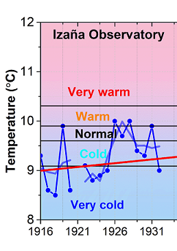
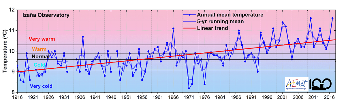
The 2017 average annual temperature at the Izaña Observatory has clearly maintained the progressive increase of the last decades, as can be seen in the following figure, which confirms the warming trend. The average annual temperature of 11.6C is located in the upper part of the “very warm” quintile of the 1961-1990 reference period used for climate change analysis. This maximum record is equal to the absolute maximum registered in 2010 of the entire 102-year series beginning in 1916.
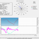
A more comprehensive analysis of temperature behaviour at Izaña throughout the year is shown in the following figure, which represents the position of average monthly temperature data for the years 2016 (orange arrow)by month and 2017 (red arrow), and the smoothed temperature distribution curves (probability density curves) in two different 30-year periods: 1) reference period 1961-1990 (grey, at the front and 50% transparency) and 2) current period 1986 -2015 (blue) as the last five-year statistical update.
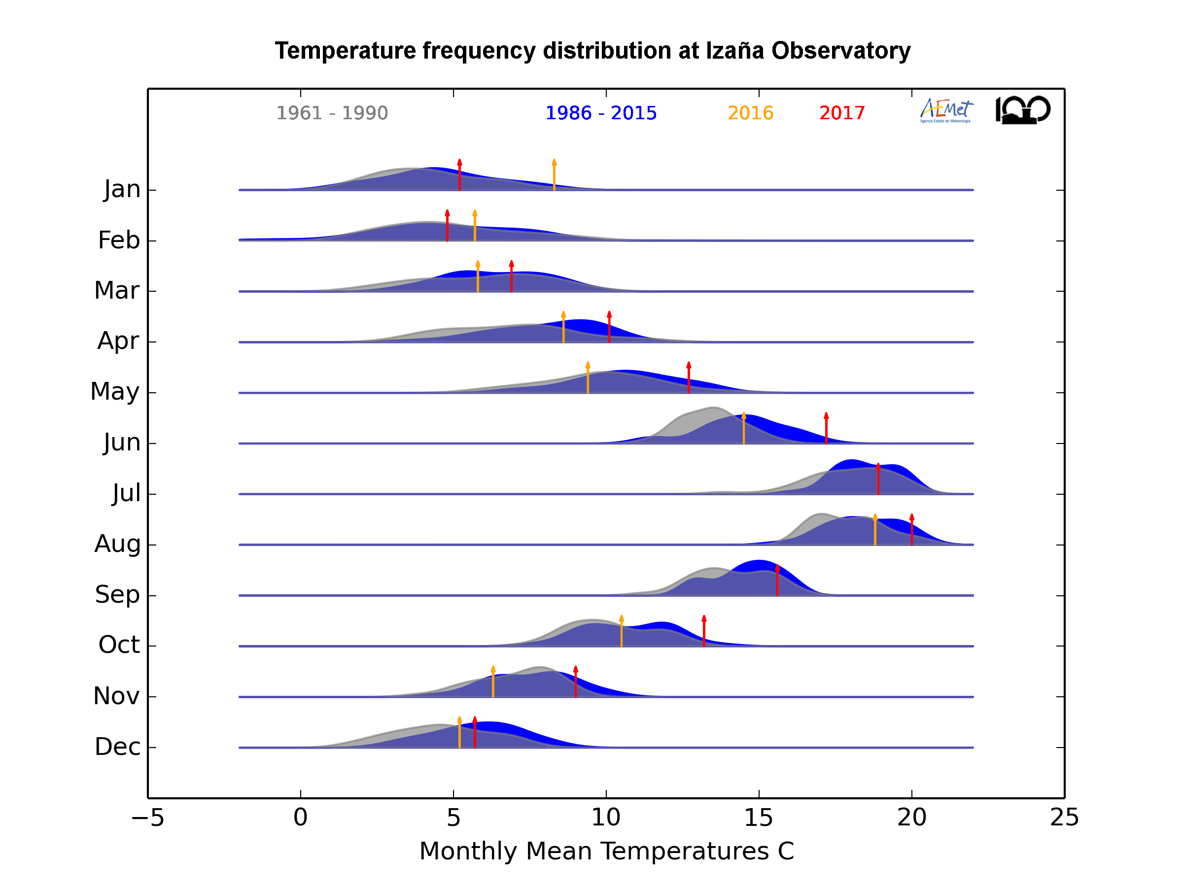
This graph (frequency diagrams) shows how the temperature distribution has changed in each month of the year in the period 1961-2015, both in relative position (representing the margins of variability), and in form. In short, the animation illustrates how often a month reached certain temperatures over time. The highest peaks in the individual chart of each month indicate that the particular month reaches that temperature more often, while the lower peaks mean that those temperatures were less frequent.
We clearly observe curves far from the normal in distribution, significantly bimodal in many cases, for almost every month. By reproducing the video, we can see how the 30-year probability density curves of average monthly temperature data have evolved in 5-year steps since the beginning of the historical series in 1916.
A clear preliminary conclusion is that the general trend of warming is not the same throughout the year. While in the middle months of winter (January and February) there is very little variation, the upward trend is more evident in the other of the months, clearly highlighting the months of April and, especially June, which would indicate the start of a premature summer.
Another interesting issue is the changes in the two relative maximums of probability in the months of transition from winter to spring (March and April) and from summer to autumn (September and October), in which significant displacement is seen in the most cold to warmer, which could correspond, respectively, to a reduction effect of winter (anticipating the beginning of spring), and prolongation of summer (delaying the beginning of autumn). The role that may be played by the coexistence of “opposing” weather situations in the same month in the bimodal shape of the temperature distribution in certain months and at certain times, is currently being analysed.
As a general conclusion it can be stated that the patent positive trend in the annual average temperature data is supported essentially in changes in the distribution of the seasons, with longer summer seasons, both at the beginning and at the end, and shorter winter seasons, mainly at the end of the season.
We thank the “Joy Division” of RealClimate.org for sharing the R codes of the “Joy plots for climate change”.
These graphs show many features and details of great interest. Analyses, reflections and ideas about what is seen in them are welcome! (ciai@aemet.es)